Case Study
Big Wins from Giving Tuesday
Innovative online fundraising and campaigning tools to help you raise more money and win more campaigns
Giving Tuesday has come to signify the beginning of the holiday giving season for much of North America and the world. This day to celebrate ‘giving’ began in 2012 and has continued to grow ever since. To recap 2018 Giving Tuesday successes, we wanted to share a few stats in comparison to 2017 and some cool things we saw nonprofits doing.
Giving Tuesday Among Engaging Networks Clients from 2017 – 2018

In addition to these interesting data bytes, we wanted to share some great homepage lightboxes, takeovers and donation forms that we hope boosted conversions on this important fundraising day. More than anything, we wanted to share some great ideas that may be useful as we move towards the end of the year.
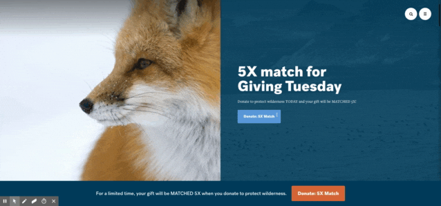
The Wilderness Society
The Wilderness Society had a lovely full-page curtain effect lightbox with a five-time match – 5x! The graphic was visually stunning and carried through to a donation form of the same brand, theme and using the same language. You’ll notice too that the form is very simplified. Less clutter means more conversions.
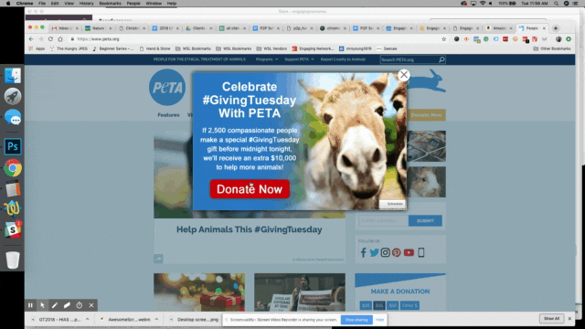
People for the Ethical Treatment of Animals – PETA US
PETA used a standard homepage lightbox with a compelling graphic. They carried through the graphic theme of an animal looking right at you to the donation page. You’ll also notice the use of a ‘locked match’ which implies they won’t get the money unless they reach their Giving Tuesday goal.
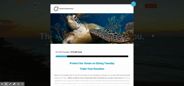
Ocean Conservancy
Ocean Conservancy went out with a full one-step donation form right in the homepage lightbox. The image, progress bar and message were simple and clear and you never had to leave the page to donate.
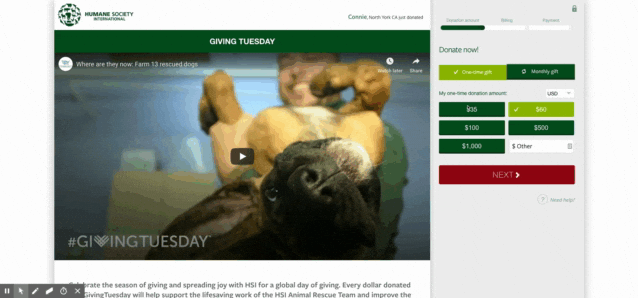
Humane Society International
HSI utilized compelling video right in the donation form this year to encourage supporters. The video wasn’t of the sad variety but rather the successes – thanks to donors like you. Also, notice the slick donor ‘ticker’ in the top right of the form. This gives donors the instant gratification they want when they give a gift.
Mercy Home for Boys and Girls
Mercy Home for Boys and Girls did something a little different on their homepage. The lightbox had some information at the top but the majority employed a subtle video that evoked happiness. If you clicked you were sent to a donation form with a progress bar, chock full of information about the cause and with a clean three-step donation process.

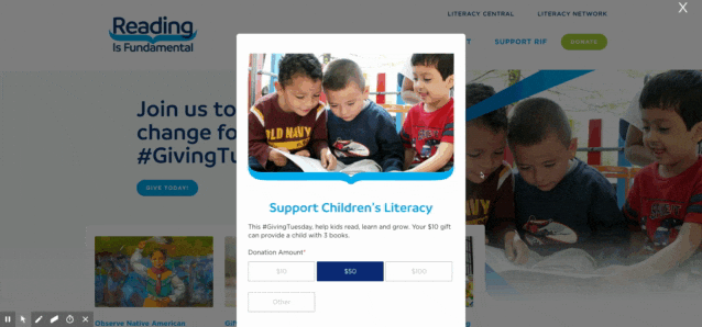
Reading is Fundamental
RIF used a three-step form within a lightbox on the homepage that allowed donors to complete their donation right in the lightbox (in three steps) before moving on. The design was simple and clean.
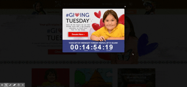
St. Labre Indian School
St. Labre employed a countdown clock directly in the homepage lightbox to inspire action. This linked to a one-step premium donation form. You’ll notice the form keeps the Giving Tuesday theme as well for consistency and urgency.
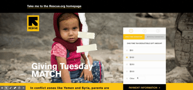
International Rescue Committee
Big beautiful full-page takeover with an image that pulls at heartstrings. Well, mine anyway. The big takeaway here is the slightly different payment process that takes place right on the homepage in the lightbox. The order moves from donation amount > credit card information > donor details – normally steps two and three are reversed. I’m wondering if they were able to capture payment information if the donor abandoned the form – or if this was tested and what the results were.
These are just a handful of examples of the many, MANY amazing things nonprofits were doing online on Giving Tuesday 2018. We hope you found a few good ideas. If you saw something you think worth noting that we didn’t share, send us an email!
Lastly, if you saw something you liked and want to know how to do this in Engaging Networks, give a shout to our Account Services Director. Or, if you’re new here, let’s set up a time to talk!